DataMagik Dashboards
Dashboard Designer Guide
Build interactive, real-time dashboards with charts, metrics, and live data from multiple sources.
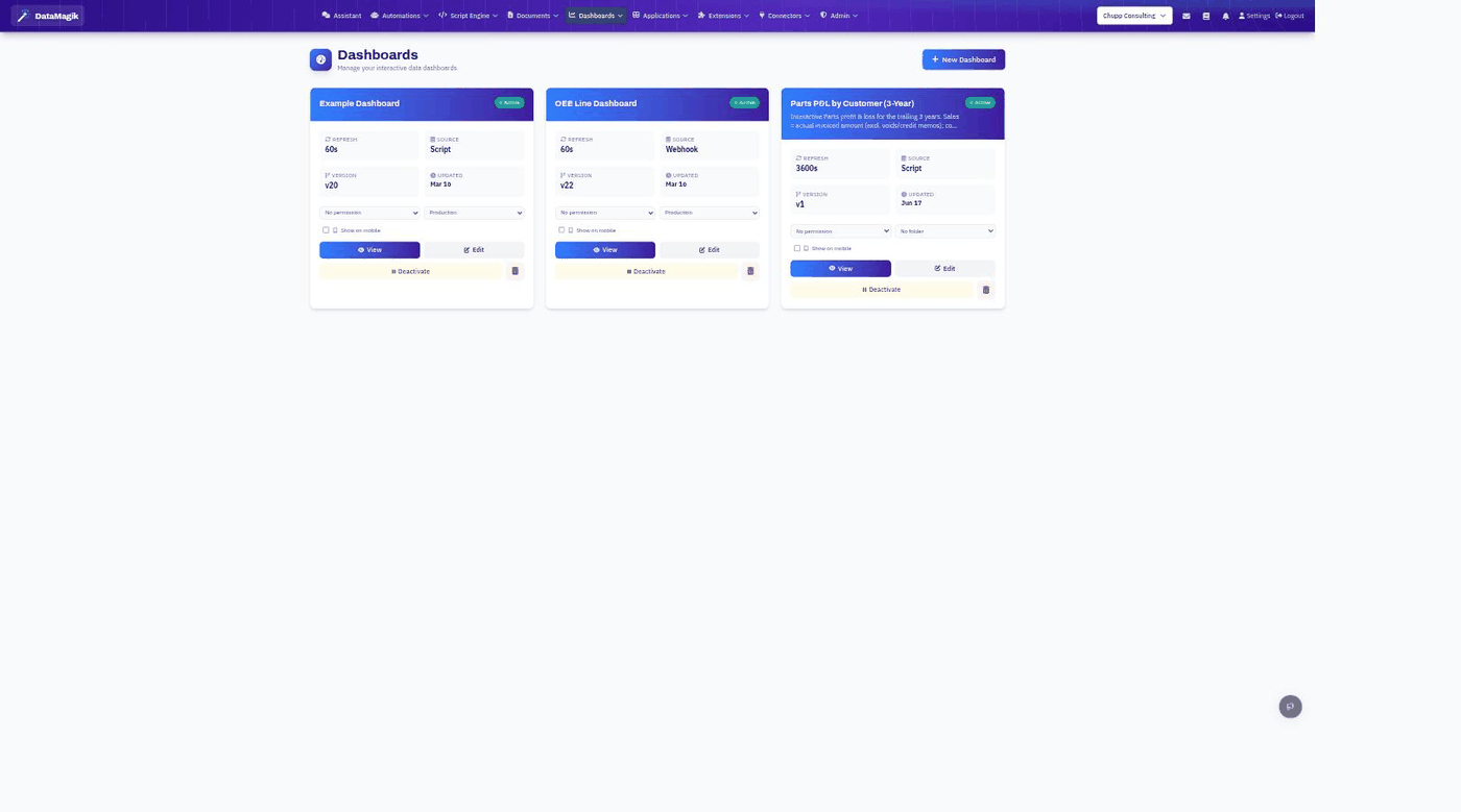
Table of Contents
- Overview
- Creating a Dashboard
- Data Sources
- Adding Elements
- Chart Types
- Metric Cards
- Data Tables
- Screen Parameters
- Layout & Styling
- Dashboard Settings
- Best Practices
1. Overview
The Dashboard Designer allows you to create interactive, real-time dashboards that display data from various sources. Dashboards can include:
- Charts — Line, bar, pie, doughnut, radar, scatter, bubble, and more
- Metric Cards — KPIs and key numbers with change indicators
- Data Tables — Tabular data with sorting and filtering
- Text Blocks — Labels, headers, and descriptions
- Embedded Dashboards — Nest dashboards within dashboards
Key Features:
- Drag & Drop — Visual layout with resizable elements on a 12-column grid
- Multiple Data Sources — Static, webhook, or Script Engine
- Auto-Refresh — Configurable refresh interval (minimum 45 seconds)
- Screen Parameters — Dynamic filtering and customization
- Version Tracking — Dashboard layout versions are tracked
- Mobile Support — Toggle Show on Mobile for mobile access
- Public Access — Optionally make dashboards publicly accessible
2. Creating a Dashboard
Step 1: Navigate to Dashboards
Go to Dashboards in the main menu.
Step 2: Create New Dashboard
Click the New Dashboard button.
Step 3: Configure Settings
| Setting | Description | Default |
|---|---|---|
| Dashboard Name | Identifier for your dashboard | Required |
| Description | What this dashboard shows | Optional |
| Refresh Interval | How often to reload data (minimum 45 seconds) | 300 seconds (5 minutes) |
| Auto-refresh enabled | Toggle automatic updates | On |
Step 4: Choose Data Source
Select your default data source type:
- Static Data — Hardcoded values for testing
- Webhook — External API endpoint
- Script Engine — Use a DataMagik script
- Mixed — Configure per element
Step 5: Add Elements
Drag elements from the palette onto the canvas.
3. Data Sources
Static Data
Best for testing or fixed values that rarely change.
{
  "sales": [
    { "month": "Jan", "revenue": 45000 },
    { "month": "Feb", "revenue": 52000 },
    { "month": "Mar", "revenue": 48000 }
  ],
  "totalRevenue": 145000,
  "averageOrder": 125.5
}
Webhook Data Source
Connect to any REST API endpoint.
| Field | Description |
|---|---|
| Webhook URL | Full URL including protocol |
| Method | GET or POST |
| Auth Type | None, Bearer Token, API Key, or Basic Auth |
Testing Your Webhook:
- Configure the URL and authentication
- Click Test Webhook
- View the response preview
- Use the Data Explorer to map fields to elements
Script Engine Data Source
Use a DataMagik script to fetch and transform data.
- Select a script from the dropdown
- Click Test Script to preview output
- Map script output fields to dashboard elements
Example Script for Dashboard:
function main(context) {
  const orders = tables.list("orders");
  const totalRevenue = orders.reduce((sum, o) => sum + o.value.total, 0);
  const orderCount = orders.length;
  return {
    success: true,
    data: { orders, totalRevenue, orderCount }
  };
}
Mixed Data Sources
Configure each element with its own data source:
- Set Default Data Source to Mixed
- When adding/editing elements, choose the source for each
- Different elements can pull from different APIs or scripts
4. Adding Elements
Element Palette
The left sidebar contains all available elements:
Charts:
- Line Chart, Bar Chart, Horizontal Bar
- Pie Chart, Doughnut, Polar Area
- Radar, Scatter, Bubble
- Area (Ribbon), Stepped Line, Stepped Area
Other Elements:
- Metric Card
- Text Block
- Data Table
- Embed Dashboard
Drag & Drop
- Click an element in the palette
- Drag it onto the canvas
- Drop where you want it
- Resize by dragging corners/edges
- Move by dragging the element body
Element Properties
Click any element on the canvas to open the Properties Panel, where you can configure data binding, styling, and display options.
5. Chart Types
Line Chart
Best for showing trends over time.
{
  "labels": ["Jan", "Feb", "Mar", "Apr", "May"],
  "datasets": [{ "label": "Revenue", "data": [12000, 19000, 15000, 22000, 18000] }]
}
Configuration Options: Title, X/Y-axis labels, line tension, fill area, show data labels.
Bar Chart
Best for comparing categories or discrete values.
{
  "labels": ["Product A", "Product B", "Product C"],
  "datasets": [{ "label": "Sales", "data": [450, 320, 280], "backgroundColor": ["#4F46E5", "#10B981", "#F59E0B"] }]
}
Configuration Options: Horizontal/vertical orientation, stacked mode, bar width, colors.
Pie & Doughnut Charts
Best for showing proportions of a whole.
{
  "labels": ["Category A", "Category B", "Category C"],
  "datasets": [{ "data": [30, 50, 20], "backgroundColor": ["#EF4444", "#3B82F6", "#10B981"] }]
}
Configuration Options: Cutout percentage (doughnut), legend, percentage labels, animation.
Radar Chart
Best for comparing multiple variables across categories.
{
  "labels": ["Speed", "Power", "Defense", "Range", "Accuracy"],
  "datasets": [
    { "label": "Player A", "data": [80, 90, 70, 85, 75] },
    { "label": "Player B", "data": [65, 75, 95, 60, 90] }
  ]
}
Scatter & Bubble Charts
Best for showing relationships between variables.
// Scatter
{ "datasets": [{ "label": "Data", "data": [{ "x": 10, "y": 20 }, { "x": 15, "y": 25 }] }] }

// Bubble (includes radius)
{ "datasets": [{ "label": "Sales", "data": [{ "x": 10, "y": 20, "r": 15 }] }] }
Advanced Chart Configuration
For complex charts, use the Advanced Chart Editor to edit the raw Chart.js configuration JSON with a live preview.
6. Metric Cards
Display key performance indicators prominently.
| Property | Description |
|---|---|
| Title | Metric name (e.g., "Total Revenue") |
| Value Field | Data path to the value (e.g., totalRevenue) |
| Format | Number, Currency, Percentage |
| Prefix / Suffix | Text before/after the value (e.g., "$" or "%") |
| Comparison Value | Previous period value for a trend indicator |
| Trend | Up/Down arrow based on the comparison |
7. Data Tables
Display tabular data with sorting and filtering. Configure the title, the data path to the array (e.g. orders), which columns to show, sorting, and pagination. Each column has a field, header, width, format (Text, Number, Currency, Date, Status), and alignment.
8. Screen Parameters
Add interactive filters to your dashboard. Each parameter has a name (e.g. startDate), label, type (Text, Number, Date, Select), default value, and — for Select — a list of options.
Using Parameters in Scripts
Parameters are passed to your script's context:
function main(context) {
  const startDate = context.startDate || "2025-01-01";
  const endDate = context.endDate || "2025-12-31";
  const data = tables.list("sales").filter(s =>
    s.value.date >= startDate && s.value.date <= endDate
  );
  return { success: true, data: { sales: data } };
}
For webhook sources, parameters are appended as query-string or body fields based on the method.
9. Layout & Styling
The dashboard uses a responsive 12-column grid (GridStack): elements snap to the grid, drag corners to resize, and drag the body to reposition.
| Size | Grid Columns | Best For |
|---|---|---|
| Small | 2-3 | Metric cards |
| Medium | 4-6 | Charts, tables |
| Large | 8-12 | Full-width charts, large tables |
Each element can be styled with a background color, text color, border, shadow, and padding.
10. Dashboard Settings
| Setting | Description |
|---|---|
| Active / Inactive | Toggle dashboard visibility without deleting it |
| Is Public | Make the dashboard accessible without authentication |
| Show on Mobile | Display in the mobile application |
| Permission | Restrict access to users with a specific permission |
| Menu Folder | Organize in a folder for navigation |
11. Best Practices
- Focus on key metrics — don't overcrowd; prioritize the data that matters.
- Use consistent styling — the same colors for the same types of data.
- Group related items together, and design for your audience (executives want KPIs, operators want detail).
- Use appropriate refresh rates — don't refresh more often than the data changes (minimum 45 seconds).
- Limit elements to roughly 10-15 per dashboard, and use pagination for large tables.